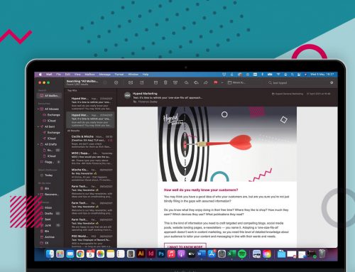
With email subscribers reporting that they will delete an email if it doesn’t look good on their mobile device, it’s essential to optimise your emails. Using mobile email design best practices ensure that designs are legible and easy to interact with not only on mobile devices, but also on tablets and desktop environments. Here are some tips on making your emails look good on mobile:
1) Enlarged Fonts
Small font is hard to read on a desktop computer, never mind on a small mobile screen. To avoid illegible fonts, we recommend 14 px as a minimum for body copy and 22 px for headlines.
2) Streamlined Content
Evaluate the content in your email and get rid of the less useful or relevant links, copy, and images. Also be concise, but still approachable. The shorter the copy, the easier it is for people to scroll on mobile.
3) Single Column Layout
While many newsletters are multi-column, mobile-friendly emails should consider switching to a single-column. This approach accommodates smaller screens and can help increase legibility. In addition, ditch detailed navigation bars. When viewed on a mobile device, navigation bars can break, are too small to tap, or simply aren’t relevant to the content of the email.
4) Touch-Friendly Buttons
When it comes to reading emails on mobile, your call-to-action must be touch-friendly. If you’re using a button, make it a minimum size of 44 px x 44 px.
5) Image-Blocking Techniques
Like webmail and desktop clients, there are numerous mobile email apps that block images. As a result, it’s important to optimise your emails to be viewed without images. Luckily, there are a number of strategies to help combat image blocking.
ALT text, which is short for alternative text, is one of the best ways to get around clients that block images by default. When images are turned off, ALT text often renders in place of the images. It’s a fantastic way to provide some context for subscribers when images are disabled.
6) Optimised Content in the Upper-Left Corner
Many mobile email apps, including some Android and BlackBerry apps, will only display the upper left-hand corner of your email. Lack of auto-scaling cuts off the right side of emails and forces users to scroll left-and-right in addition to up-and-down to view your entire message. As a result, it’s important to place important information and CTAs in the upper-left corner of your email.
Hopefully, these tips will help you with your next email campaigns!