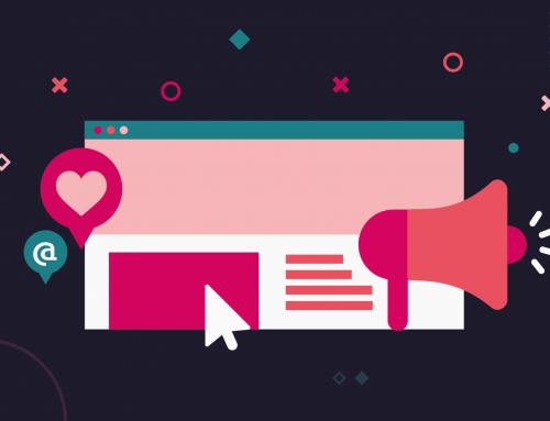
In today’s digital world, you need a strong online presence to capture and demand attention. And that presence starts with a first-rate website.
A good website will entice customers and act as the hub for all your digital marketing activities, so it needs to look (and sound) spectacular. But if you want your website to allow people to find out more about your business, the services you offer and the types of products you sell, it must be designed and built in the right way.
So, what are some of the different design, content and technical principles you should consider when designing and building a new website — or refreshing an existing one?
1. Consistency
The most important thing to keep in mind across every aspect of your web design is consistency. Is your design congruent across every page of your website? Is your branding the same on and off the web? This is essential to create a cohesive overall brand that the audience can become familiar with.
2. Simplicity
Occam’s razor theory suggests that the simplest solution is usually the best. If your website is too fussy, too difficult to navigate or too overwhelming to take information on board, it will be harder to attract and keep visitors.
3. Usability
Usability is all about functionality and ease of navigation. If your website is confusing and difficult to navigate or your potential customer can’t find what they’re looking for easily, they’ll quickly give up and seek what they’re looking for elsewhere. Clear headings, menu tabs, buttons and a streamlined layout can help guide them through the user journey as they navigate your site.
4. Compelling language
Your website might look great, but if the messaging and language doesn’t connect with the reader, you’ll find it harder to convert visitors into customers. The content on your page is just as important as the design and should convey your key messages while engaging the reader.
5. Mobile friendly
Your website design might look great when you load it up on a laptop. But does this translate onto other hand-held devices? To maximise usability, make sure your website is optimised for different devices and looks just as good on mobile as it does on a desktop.

6. Bold CTAs
When you’re shopping online, the ‘buy it now’ button always stands out more than anything else. To convert visits into actions, your ‘calls to action’ should demand users’ attention. If it fits your brand’s tone of voice, writing CTAs from the user’s perspective (‘Take me to the checkout’) can also prove to be very effective at inciting action.
7. Minimising load time
The longer it takes for your website to load, the less likely your customers are to stick around — if your web pages don’t load within three seconds, you’ll lose around 40% of your visitors. You can minimise load time by optimising image sizes, compressing your resources and code files or auditing your plugins folder.
8. Visual hierarchy
Did you know that we automatically assign importance to random elements depending on factors like their size, position or colour? This is why it’s essential to establish a focal point on the page to lead visitors to the most important information and use cues to guide them through the site.
9. Grid-based layout
The way a design is laid out on the page is important for attracting — not distracting — visitors. For example, the ‘rule of thirds’ is a simple design principle that splits an image into nine equal parts by two equally spaced horizontal lines and two equally spaced vertical lines, because this has been found to create more visually appealing images. The grid-based layout helps content appear balanced and ordered on the page by arranging it into a clean structure.
10. The Golden Ratio
The Golden Ratio is a mathematical ratio commonly found in nature. When used in design, it fosters organic and natural-looking compositions that are aesthetically pleasing to the eye. You can use the Golden Ratio as part of your web design to create an aesthetically pleasing layout and appeal to the user’s subconscious.
11. F-shaped pattern reading
Eye-tracking studies have shown that the F-shaped pattern, which mimics our natural pattern of reading in the West, is the most common way we scan text on a website. An effective web design will take this into account and structure information around readers’ natural viewing patterns.
12. Hick’s Law
Hick’s Law states that every additional choice increases the time required to make a decision, therefore reducing the likelihood of an action being taken. Incorporating elements like search filters into your webpage design helps improve the efficiency of your website and direct visitors to what they are looking for in fewer steps.
13. Fitt’s Law
Ever noticed that the ‘Play’ button is the biggest element on your Spotify screen? Fitt’s Law suggests that the closer and bigger the object is, the easier it is to use. Keep this in mind when designing your website to direct people to action buttons.
14. Gestalt design laws
The human brain can perceive an image in its entirety before taking in its individual components. When applied to web design, this means that a visitor will take in the webpage as a whole before noticing individual elements such as headers or menus. Taking into account the various laws of proximity, similarity, symmetry and continuity when designing your website will help curate a satisfying user experience and direct visitors to the information you want them to see.
15. White space
Sometimes, less really is more. A page without white (or ‘negative’) space will be too busy and overwhelming for visitors to enjoy and understand. Making use of white space creates a ‘clean’ website that is easy to navigate and helps your content stand out.
Looking to develop or improve your company’s website? Our website design and build services can ensure a smooth transition from inception to completion. Get in touch today to find out how we can help.