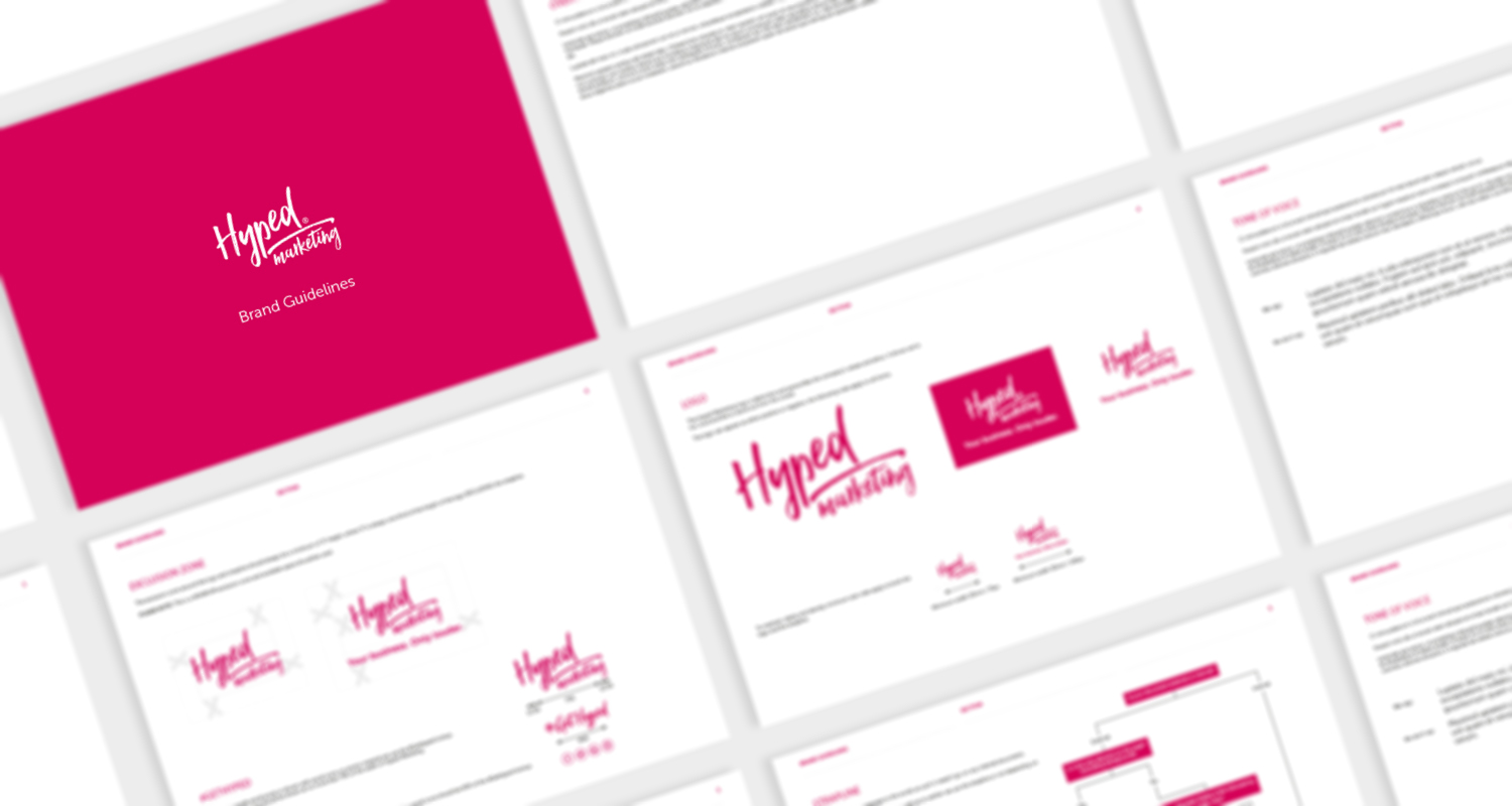
How well do you really know your business?
Do you know which derivative of your logo to use on a pink background? Have you got a preferred font for PowerPoint presentations? Would you be able to look at a range of social posts and pick out the ones from your brand?
If your answer to any of the above is no, it’s probably time to think about your brand guidelines. Whether you’ve already got a set but feel they need a refresh or you’re starting from scratch, it’s crucial to have a firm grasp on your marketing do’s and don’ts.
Consistency makes you memorable
Before we get into the details of what to include, why do you even need brand guidelines? The simple answer is consistency.
Consistency is arguably the most important element of marketing. It makes your brand recognisable and helps you become known for a certain look and feel. Having a consistent brand also builds familiarity with your audience. People want to know what to expect from you. If you’re persistently using the same logos, imagery and tone of voice (TOV), people will start to take note and, over time, become fond of your brand. This is how brands become household names.
What’s more, just because you think you know your business inside out doesn’t mean everyone who joins your team does. For anyone creating marketing materials for your business, brand guidelines are an invaluable tool to ensure everything is in line with your desired look and feel.
Building your brand
Having a set of concrete brand rules will help your company look its best at all times. So, what type of things should you include in your brand guidelines?
1. Define your vibe with TOV
Tone of voice is your brand’s personality coming through in words. Do you want to appear funny or serious? Casual or formal? Cheeky or respectful? Enthusiastic or matter of fact? Your TOV will be a blend of these different elements and work on a scale.
In your brand guidelines, you should clearly state “we write like this” and “we don’t write like this”. Are there any words you don’t like? Can you use casual contractions (“you’re”, “it’s”, “can’t”) or would you prefer to take the more formal route and avoid them? Are you comfortable shortening your brand name from, say, “Hyped Marketing” to “Hyped” or should the full name be used at all times?
These are all important things to consider if you want to make sure anyone writing marketing materials for you is on the same page.
2. Pick (and stick to) your colour palette
Colours have a remarkable way of evoking certain feelings. For example, blue is often associated with trust, which is why you’ll see banks and hospitals use it a lot. Once you’ve chosen your colour palette, it’s important to stick to it to create a cohesive feel across all materials.
Your brand guidelines should contain CMYK, RGB, Pantone and Hex colour references for each colour in your palette. These references make it easy for anyone producing or printing materials for you to ensure they have an exact colour match — rather than just taking a wild guess!
3. Learn your logos
Your logo should reflect what your company does day-to-day and marry together your colour palette and TOV into one little emblem.
Most businesses have derivatives of their primary logo, which should be used wherever possible. Your choice of logo will depend on where it appears. For example, you might use a white version of your logo on a solid colour background or a black version when colour printing isn’t available. Icon logos (with no accompanying text) also tend to be more suitable for social media profiles.
It’s also important that your guidelines include the correct proportions, opacity, colour usage and exclusion zone so that your logo always appears as intended. No one likes a squashed, off-colour logo!

4. Tune into typeface
Selecting one or two fonts to be used across all materials is vital for maintaining consistency and expressing your brand personality. Do you prefer serif or sans serif? Sans serif is becoming increasingly popular (particularly for online materials as it’s easier to read on a screen) but serif still has a more formal effect.
In your guidelines, define where these fonts should be used. For example, you might use one for internal communications and another for external or different ones for online or offline materials. It’s also worth choosing one font for headings and another for body copy or sub-headings. Make sure you note which colours from your palette should be used as well.
5. Include the right imagery
Elegant copy, snazzy colours and a slick logo are all essential for your brand’s identity. But what about images? It’s key to include a section in your guidelines about the kind of imagery that should be used across your marketing materials.
Do you prefer photographic or illustrative imagery? Should your images feature people? Will you take the photos yourself or are you sourcing them elsewhere? If so, where are you sourcing them from? Get it all written down to ensure all imagery used is in line with the look and feel you want to create.
It’s never too late…
You may be reading this and thinking it’s too late for you to draw up brand guidelines for your company — but it never is.
While it may feel daunting to overhaul the way you produce your marketing materials, progressing with more consistency only cements what works for your brand and helps dispose of anything that doesn’t.
Are you looking to refine your brand and ensure it’s instantly recognisable? Get in touch with us today to learn more about our branding services and how we can help create brand guidelines and a TOV document for your business.


